Question types:
- Open Text
- Multi/single select
- A/B
- Swipe
- Image Highlight
- Image grid
- Media capture
- Ranking
- Info Image
-
- Summary for each Question
- Stimulus templates
Settings for each question – explanation of symbols
- LOGIC – FOR ANSWER OPTION (each answer can have a logic set up)
- LOGIC – FOR QUESTION (logic only possible for the whole question, not based on answer selected)
Open text Question:
- User writes an open text answer to a question
-
The question copy has a character limit of 200 characters (otherwise it will be cut / not fully displayed in the app)
- There is an option to provide a hint in the ‘text box’
- If no specific hint is provided – use ‘Please type here’ or similar
- If question is too long to fit: It can be added to the hint
-
If question text is too long and would be cut – solutions:
- It can be added to the hint
- It can be shown in an info image before the question. The actual question will be shortened
- Character limits can be set up manually (Users must write at least set up character limits to be able to continue)
- If a Brief builder upload is used – 5 characters filled as default
- If no character limits se up while building from scratch – 1 character limit as default
- Recommended to set it to 25 characters (~5 words) if more detailed response is required
-
Important- if short answer is required – make sure character limits are set up accordingly - e.g. postcode, names… Some languages required less character limits – e.g. Chinese, Arabic…
-
AI Moderation Helper = can be activated to check the user’s response in real time and suggest improvements while answering the brief
- LOGIC possible for whole question – will route/end for everyone if logic set up
Multi/single select
-
Users can choose from up to 16 text options, plus “Other” and “None of the above”
- Other (please specify): Lets users type a custom answer. Enable if required. No logic supported
- None of these. None of the above : Deselects any other chosen options. Enable if required. No logic supported
-
Options can be randomised, but Other and None of the above always appear at the bottom
-
Selection rules:
- Exactly: User must select the exact number set (e.g. Exactly 1 = single select, Exactly 3 = must pick 3)
- At least = User must select a minimum number (e.g. At least 2 = 2 or more)
-
At most = Sets a maximum number (e.g. Up to 3 = 1–3)
-
LOGIC rules:
- MULTIROUTING SUPPORTED FOR 'EXACTLY 1” OPTION (SINGLE SELECT)
- NO LOGIC FOR 'OTHER” or 'NONE OF THESE”
-
NO MULTI ROUTING FOR MULTI-SELECT OPTIONS (except when all answers route to the same place, and Other/None are not included)
-
LINKED BRIEFS:
- Option to tick – “Allow child briefs to have different multiple-choice options” = this will enable to list a different number of options for single/multi select type question for linked briefs (e.g. brand list)
AB / ABCD
-
User chooses between either 2 OR 4 answer options in a format:
- Image + Text - (text short – up to 29 characters max). If text used = will overlay the picture
- Only Image
- Note: Only 3 options shouldn’t be listed - it must be either 2 or 4. If 3 are needed, the 4th option will still be activated (even if left blank), which users may accidentally select
- Only a single selection is available
- The question copy is limited to one (short) sentence (otherwise it will be cut/ not fully displayed in the app)
-
Description / instruction – recommended - use ‘Tap one!’ / ‘Select one!’ unless otherwise needed
-
LOGIC possible for answer option
-
If question text is too long and would be cut – solutions:
- It can be shown in an info image before the question. The actual question will be shortened
- Multi – single select question used instead (without image option)
Swipe
- ·Tinder-style swipe question most often used for yes or no answers. Users will “swipe” to select the option
-
Image can be used:
- Only image used and question is listed under the picture (no text overlaying the picture)
- Text can be added to the image – text overlay the picture
- The question copy is limited to one (short) sentence (otherwise it will be cut/ not fully displayed in the app)
- Description / instruction – recommended – use ‘Swipe!’ unless otherwise needed
- If only “No”, “Yes” answers needed – recommended to set up - left action is ‘no’ and ‘right action is ‘yes’
- Other usage - can be used to choose between 2 – e.g. 'Which colour do you prefer?” -> Swipe left for Red, right for Pink -> listing options Red and Pink
-
Short options for swipe supported – Max character limit =15 characters
-
LOGIC possible for answer option
-
If question text is too long and would be cut – solutions:
- It can be shown in an info image before the question. The actual question will be shortened
Image highlight
- Users can tap and highlight parts of an image.
-
Options to choose from before they highlight the screen:
- Positive icon = thump up
- Negative = thump down
- Neutral = question mark icon
- The question copy is limited to one (short) sentence (otherwise it will be cut/ not fully displayed in the app) - RECOMMENDED: What do you like, dislike, or find confusing about this image?
- Description – RECOMMENDED: 👉 Tap anywhere on the image to select the specific detail you’re commenting on.
-
The default answer hint copy is ‘Tell us more’ unless otherwise stated
-
Before image highlight questions we recommend (or variation of) the following text in an info image:
In the next questions, you will see an image of a new concept.
Please tap on the parts of the image that:- you like = 👍 Thumbs up
- you dislike = 👎 Thumbs down
- you find confusing or feel neutral about = ❓ Question mark
After selecting an area, please explain why.
Users will see it like this:
Once they tap on "Show image" they can:
- Zoom in the image
- Select thumbs up, thumbs down or question mark
-
Add their comment why
- LOGIC NOT POSSILBLE under this question
Image grid
- Users choose between up to 9 image answer options (NO TEXT OVERLAY)
- The question copy is limited to one (short) sentence (otherwise cut)
- Mandatory question to be answered after selecting can be enabled ·a certain option
- Randomisation possible (images will be rotated)
-
LABEL under each image = not visible to the users in the app. Will be visible under dashboard and PPT export
-
Selection rules:
- Exactly: User must select the exact number set (e.g. Exactly 1 = single select, Exactly 3 = must pick 3)
- At least = User must select a minimum number (e.g. At least 2 = 2 or more)
- At most = Sets a maximum number (e.g. Up to 3 = 1–3)
- Recommended: If multiple selections are required, state this in the question (e.g. “Select all that apply”, “Select up to 3”)
-
LOGIC possible for whole question – will route/end for everyone if logic set up = WE CANNOT ROUTE DEPENDING ON SELECTION
-
If question text is too long and would be cut – solutions:
- It can be shown in an info image before the question. The actual question will be shortened
Media capture
- User can upload ONE photo, or ONE video or ONE audio file per one question
- Video is max 3 minutes long
- Users can record what's in front of them/or switch to selfie mode when they get to this question (once selected, they can’t switch back to the other view), or they upload what's in their library
- Current functionality only allows 1 upload (photo, video, audio). If multiple media uploads are required – a separate/ additional media capture question needs to be asked
-
Once users start recording – they CANNOT see the question anymore, but it will ask them if they are happy to submit their video. (they can retake it)
-
LOGIC possible for whole question – will route/end for everyone if logic set up
- AUDIO option: Currently NO transcript or AI analysis available
-
Media capture – scenarios & recommendations:
-
Asking users to leave the app (e.g. Google something):
- Use a short instruction in an info image and repeat it in the brief description
- Example info image text: “Please go to Google (or another browser), find a picture of XX, save it, then return to the Bulbshare app and press Next. You’ll upload it on the next screen.” •
-
Requiring a specific image or video:
- Clearly state requirements both in the info image and brief description to improve quality
- Info image examples: “Please upload a photo of XXX. Make sure you are XXX (e.g. at home) and have the image ready before starting.” / “Please record and upload a video of XXX in a quiet place where we can see and hear you clearly.”
- Brief description example: “This brief requires a video of at least X minutes about XXX. Only take part if you’re comfortable recording a video. All video responses are reviewed, and rewards are issued only if requirements are met. Reviews and rewards are completed within 10 days.” •
-
Letting users choose text or video - Recommended setup:
- Info image: xxx “You can answer this question via text or video.”
- Question (single select): “How would you like to answer?” → Text / Video
- Logic: Text → open text question / Video → media upload question
- Ensure users are routed to only one path
-
Optional additional media upload - Recommended setup:
- Question (single select):“Would you like to upload another photo/video/audio?” → Yes / No
- Logic: No → skip next media question / Yes → show additional media upload question
- Ensure users are routed to only one path
-
Asking users to leave the app (e.g. Google something):
Ranking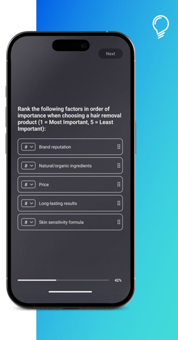
-
User ranks the options by:
- Selecting the number to move it up or down in the priority
-
Dragging and dropping into the right position in the app
- There is a maximum of 16 answer options available - not recommended to list all 16 as the list it too long for ranking ·
-
Randomisation is possible.
- LOGIC possible for whole question – will route/end for everyone if logic set up = WE CANNOT ROUTE DEPENDING ON SELECTION
Info Image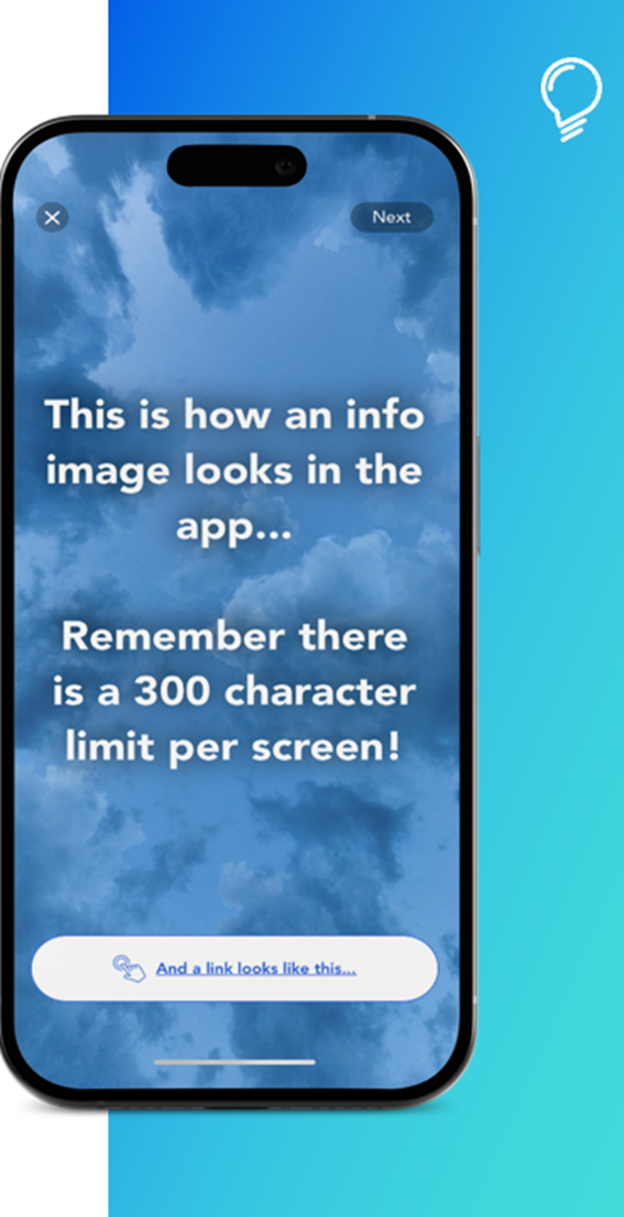
- Used to provide information to guide the user, break up questions, show stimulus and share URL links
- It is NOT the actual question
- It can include any text or picture (and links if needed). There is a 300-character limit per screen - if the text is longer than 300 characters, split it across multiple info image screens
- Whenever possible, use stimulus materials in portrait orientation to ensure compatibility with phone screens. Follow the correct dimensions (see session Stims dimensions)
- The text in an info image will be displayed on a predefined channel specific background colour OR any other relevant image background if uploaded as background.
- Text will overlay the picture. If you want to show a specific picture, use only picture and put text in the page before / after – avoid blocking the image.
- URL link can be added under Info image – used when community users need to watch video. After watching video, they will go back to the brief and can answer any follow-up questions
-
Timer is possible
-
LOGIC is NOT supported for info image
- IMPORTANT: If routing or ending the brief is needed after Info Image, add a follow-up question with logic (e.g. “Anything else to add?” → end survey)
Group
-
Used for:
- Cloning multiple questions - useful if repeated questions across different concepts (if building brief from scratch = “empty brief”)
- Randomisation - Groups can be nested within another group for randomisation
- It is NOT the actual question - used for grouping questions in the Brief
-
Important Notes:
- Randomization vs. Logic: They counteract each other. If logic moves between groups, randomization won’t work → Tip: Add an info image or a question at the end of each group to keep logic within the group
- Randomised groups & Info Images: Avoid 'First,” 'Last,” or 'Second” labels, as the order will change
Summary for each Question:
Stimulus templates
-
They are currently NOT auto-fitted under our platform hence the template needs to be used - to make sure they are fully visible in the app (not cut)
-
Applicable for question types where we can input image:
- Info Image
- A/B or A/B/C/D (if 4 options activated) = has a different stim template
- Image highlight
- Image grid
- Swipe
-
PPT template to be used:
- Input picture
- Go to picture format
- Crop
- Select to FIT (not to fill)
Recommended image dimensions:
-
Info Image
Size: 1080x1920 px
Format: JPG or PNG with no transparency
Under 500K -
Image Highlighting
Size: 750x 1000 px
Format: JPG or PNG with no transparency
Under 500K -
Swipe images:
Size: 750×1000 px
Format: JPG, PNG or GIF with no transparency
Under 500kb -
A/B images:
Size: 750×500 px
Format: JPG, PNG or GIF with no transparency
Under 500kb -
ABCD images
Size: 375×500 px
Format: JPG, PNG or GIF with no transparency
Under 500kb -
Image Grid
Size: landscape images in a 3:2 ratio - for example, 1200 x 800 px or 1500 x 1000 px
Format: JPG, PNG or GIF with no transparency
Under 500kbAvoid portrait or square images, as they may be cropped at the top and bottom when displayed in the survey.
3:2 landscape images provide the best and most consistent display across desktop and mobile.
- Use the stimulus template based on the question type - download below
Comments
Please sign in to leave a comment.